RD Residential Design | DESIGN LAB: THE VIEW HOUSE
Humans and nature align beautifully in three very different settings.
Chain Bridge House | McInturff Architects
Architecture DC Fall 2019 | Chapter Design Award in Interior Design
Politics and Prose Staff Offices.
McInturff Architects
Architecture DC Summer 2019 | Featured
Responding to a Growing Need: Architects Design Community Gardens with Flair
StudioMB
Architecture DC Winter 2017 | Heavenly Stairways
Two Projects Called Out for Divine Details.
Mathewson Residence Staircase | Shinberg.Levinas Architects
Architecture DC Winter 2016 | Un-Surburbia
Six Houses Offer New Ideas for 21st-Century Lives
Singh Hoysted Live/Work House on Poplar Avenue | McInturff Architects
Remodeling April 2014 | Modernist Maryland Home Plays Well with Family and Friends
A builder and architect work together to transform mid-century ugly into an award-winning modernist home.
Poplar House | McInturff Architects
AIA DC Design Award 2014 | Merit Award: Interior Architecture
Overlook Residence | Robert M. Gurney, Architect FAIA
Luxe 2014 | On Display: Feature Project
A bachelor's Arlington penthouse is transformed into the perfect pad to exhibit his modern art collection as well as entertain guests.
Arlington Apartment | Solis Betancourt & Sherril | Barnes Vanze Architects
Home & Design Fall 2014 | Signature Style: Featured Project
Jacobsen Architecture imbues a downtown DC co-op with the firm's trademark modern aesthetic
Shoreham West | Jacobsen Architecture
Architecture DC | Rooms of One's Own: Exemplary Condominium and Multi-family Projects
“The O/K Calvert Street project, an 1,850-square-foot, one-bedroom condominium in Washington’s Woodley Park neighbourhood, converted a dark, north-facing unit in a 1970s ear building into a light-suffused residence with an almost Zen-like serenity.”
Shoreham West | Jacobsen Architecture
Remodeling Magazine August 2013 | Tone Poem
Once a neighborhood wallflower, this remodeled modernist "box" blossoms into the life of the party. The design's bold, idiosyncratic personality perfectly suits a dual role as family home and occasional concert venue.
Poplar Residence | McInturff Architects
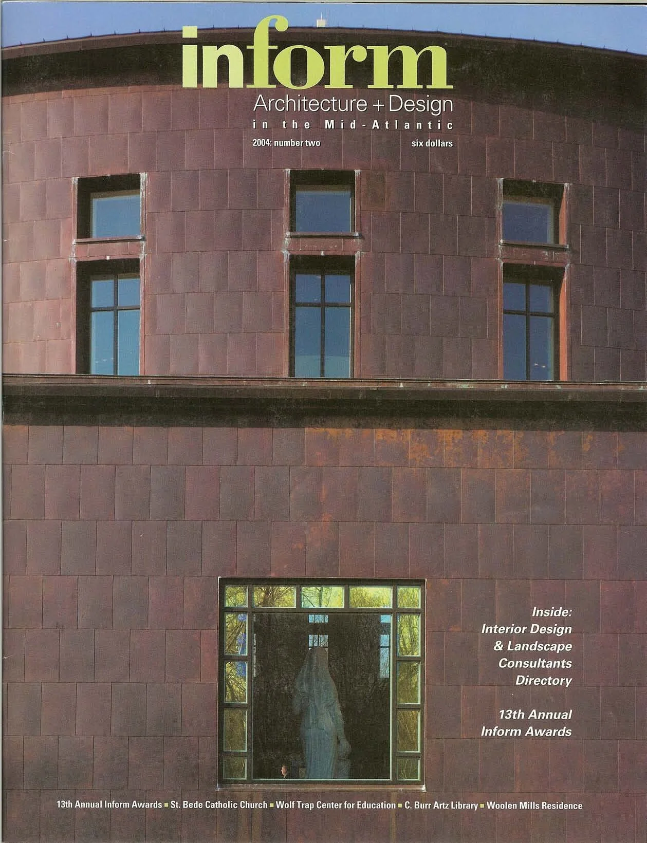
Inform 2013 | Honor Award | VSAIA Design Awards for Interiors
Once a neighborhood wallflower, this remodeled modernist "box" blossoms into the life of the party. The design's bold, idiosyncratic personality perfectly suits a dual role as family home and occasional concert venue.
Watergate East | Robert M. Gurney, Architect FAIA
Remodeling 2013 | Merit Award | Outside the Box
The judges scored the remodel very highly in all categories. They complimented this whole-house remodel on its ability to stand out while working within the constraints of the budget, calling it a simple but “fresh” project. Another element that appealed to them was the deck detail of steel beams rising at an angle.
Poplar House | McInturff Architects
Inform 2012 | Honor Award | Object Design
Jury Comments: “This small, demountable ‘corn-crib’ cabin creates an elegant shelter, complete with a kitchen and sleeping loft, that has a minimal impact on the site and that allows for rapid construction…Its fun, portable, environmentally responsible.”
The Crib | Broadhurst Architects
AIA Maryland Design Award 2011 | Excellence in Design
Jury Comments: “There are a number of projects that are similar to this; small footprint, simple to build, possibly portable, minimal but adequate accommodation. Not many have this degree rigor in material use, and particularly, detailing.”
The Crib | Broadhurst Architects
Remodeling’s Big50 | Honor Award
Added Dimensions was honored to receive this award from its industry partners in recognition of its excellence in quality and service as reflected in the high level of customer satisfaction, its strong leadership and organization, its community service, and productive work atmosphere.
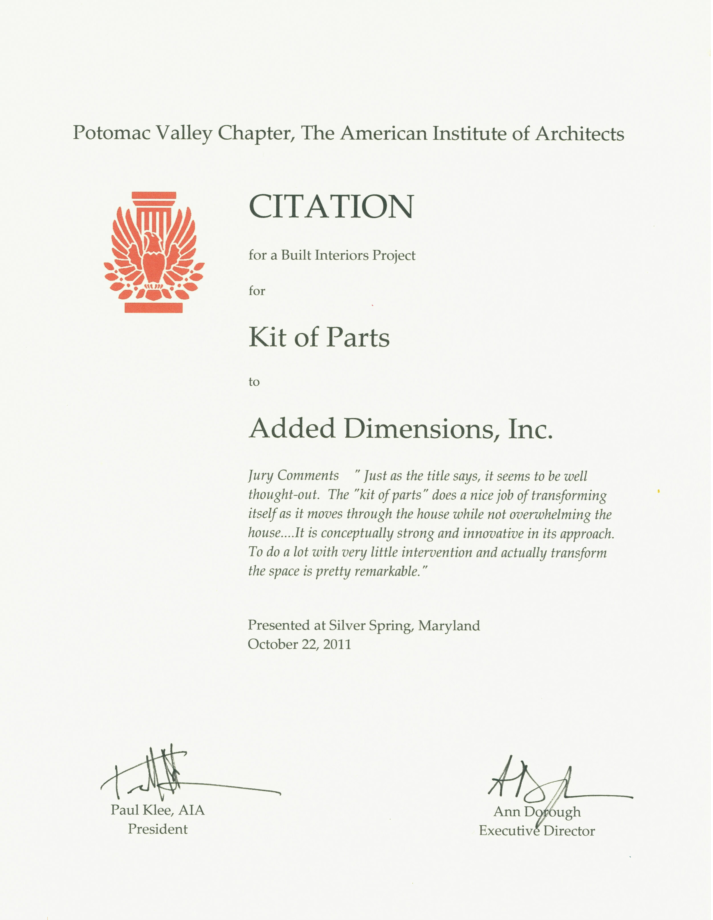
AIA Award 2011 | Kit of Parts
Jury Comments " Just as the title says, it seems to be well thought-out. The "kit of parts" does a nice job of transforming itself as it moves through the house while not overwhelming the house....It is conceptually strong and innovative in its approach. To do a lot with very little intervention and actually transform the space is pretty remarkable."
Kit of Parts | McInturff Architects
AIA Award 2011 | The Crib
Jury Comments "This is a really fun project, like a folly. But it demonstrates some really intelligent strategies when it comes to prefabricating or preassembling the structure. The interior spaces were light-filled and obviously connected to the outside. For a very small space, they actually do quite a bit with it....They didn 't shy away from being playful with modern, iconic forms and the silhouette."
The Crib | Broadhurst Architects
Washington Chapter AIA 2011 | Washingtonian Award
Watergate Apartment | Robert M. Gurney Architect
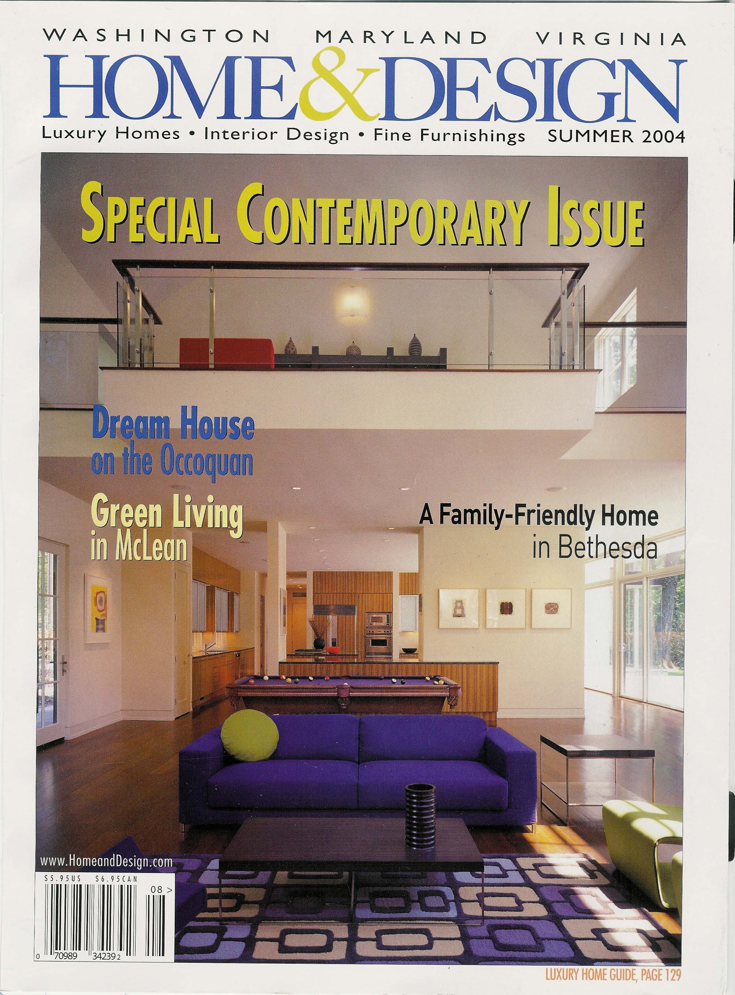
Home & Design Magazine | Urban Chic: Feature Project
“Reflecting on how the project evolved over time, Cole and Prevost recall the many hours discussing ideas with their design-savvy client and working with contractor Alan Kanner…to make their shared vision a reality. The result is a clean-lined, minimal space that look deceptively straightforward.”
Adams Morgan Loft | ColePrevost
Builder Magazine | Design Award Winner
As so often happens with remodels, this project started as a simple request for bookshelves and then got bigger. But not bigger than it needed to be—thanks to an ingenious “kit of parts,” designed by McInturff Architects, which completely transformed the living spaces inside this classic bungalow with nary a structural change, other than moving a couple of windows.
Kit of Parts | McInturff Architects
AIA Maryland Design Award 2010 | Merit Award
The Maryland State Component of The American Institute of Architects presents this MERIT AWARD to Added Dimensions, Inc. for Excellence in Design of Matryoshka Bethesda, Maryland
Matryoshka | David Jameson Architect
Design Arlington | Award of Excellence
Presented to Added Dimensions, Inc. on January 26, 2010 to recognize their construction of the Spout Run Residence on 2758 North Nelson Street. Signed by Jay Fisette Chairman of the Arlington Country Board.
Spout Run Residence | David Jameson Architect
Architecture DC Winter 2009 | Detail Award in Architecture
"It is the proposition of this project that a house can be transformed through select, delicate, and adaptable interventions rather than wholesale renovation" -McInturff Architects.
Kit of Parts | McInturff Architects
Architecture DC Winter 2009 | Award Winning Home
“Matryoshka,” as in the traditional Russian nesting dolls? Exactly. This Bethesda house is organized in much the same way as the doll sets, consisting of a series of forms nested one inside the other. In this case, however, the forms vary not just in size, but also in materials, proportions, and degree of enclosure...
Matryoshka | David Jameson Architect
Washington Post Magazine | Into the Wild
An Arlington Family reconnects their house to the nature surrounding it.
Spout Run | David Jameson Architect
Architectural Digest | New Order in the Capital
A Turn-of-the-Last-Century Apartment is Transformed by "uncrating the apartment from its boxes" and applying new architectural proportions to the space.
Ontario Apartment | Robert M. Gurney Architect
Washingtonian Magazine | Award for Distinctive Residential Architecture
The Washingtonian and the Washington Chapter of the American Institute of Architects presents this award for distinctive residential architecture to Added Dimensions, Inc.
Spout Run | David Jameson Architec
Washingtonian Magazine | Award for Distinctive Residential Architecture
The Washingtonian and the Washington Chapter of the American Institute of Architects presents this award for distinctive residential architecture to Added Dimensions, Inc.
Hall Place | Kube Architecture
Washington Post Magazine | Love's Renovation
“The highlight of the apartment is the kitchen, a module of cherry wood and frosted glass cabinets in the shape of a trapezoid, with stainless-steel backslashes under a dropped ceiling the color of French lavendar. Black granite counters wide enough for rolling our pasrty dough and bar designed to accommodate cooking students are arranged at the edges, along with appliances.”
Northumberland Residence | ColePrevost
Inform Award 2007 | Honor Award | Bare Essentials
When the Ontario Apartment Building was constructed in 1906, its builders surely meant for its elaborate Beaux-Arts façades and stairways to evoke an air of drama. A century later, however, much of the building had become dark and disorienting. In this apartment conversion, the architect created a spare, modern space through the generous use of glass and translucent panels.
Ontario Apartment | Robert M. Gurney Architect
ChesapeakeHome | Cover Page Featured House
Adding a second story and renovating a 1950s ranch-home allowed the homeowners and designers to go modern with shades of green. Contemporary styling mixed with some eco-friendly design principles and building materials results in a recycled home well-suited to 21st century life
Silver Spring Bungalow | ColePrevost
Custom Home Magazine | Grand Award
The Custom Home Design Award panel had a hard time tearing itself away from this entry, which one judge deemed “one of the best detailed houses we’ve seen today.” Another noted, “To do something like this that is so pure and so demanding of the geometry within an existing shell is so hard to do.”
Ontario Apartment | Robert M. Gurney Architect
Residential Architect | Grand Award Winner
Before it was a dark, disorienting apartment in a Beaux-Arts building. Now the new living spaces are strikingly clear-minded, thanks to a linear floor plan and a reductive palette of white walls, aluminum accents, stainless steel countertops, translucent-glass room dividers, limestone floors, and wenge paneling and cabinetry. The jury applauded the consistent, comprehensive interior. “The details are elegant, and a common thread runs through them,” said one judge. “It's integrated perfectly.”
Ontario Apartment | Robert M. Gurney Architect
Home & Design Magazine | Artist in Residence
ColePrevost remodels a 1923 home in DC to create a modern studio for painter Madeleine Keesing.
Art Residence | ColePrevost
Kitchen and Bath Ideas | Bold Frontier: Featured Project
“[The] Master bath is a striking sanctuary that combines Montana spaciousness with urban-contemporary edginess to provide a relaxing escape from a hectic life.”
Crescent Residence | ColePrevost
Home & Design Magazine | Featured Renovation
It didn't take the client couple long to realize that its closed-in rooms and dim hallways would have to go. They wanted to create more efficient spaces and take better advantage of abundant natural light while preserving the integrity of the historic building.
The designers planned a new layout that would encompass two offices, a principal bedroom and a guest room, an additional bathroom and a professional-grade kitchen. Added Dimensions started by tearing out the walls--a move that revealed a welcome surprise...
Northumberland Residence | Cole Prevost
Complete Bathroom Design | A Steely Calm
"The client wanted a 'knock 'em dead," cool-looking place. We did our best to meet that and also keep it practical and functional." -Robert Cole
Crescent Residence | ColePrevost
Washington Post Magazine | Feature Article Project
Eight months and $380,000 later, this Ranchburger has ascended to filet-mignon status inside and out, owing to a 50-foot-wide wall of translucent fiberglass set in a metal grid across the top front of the building. By day it resembles an enormous shoji screen; by night, lit from within, it glows like a Japanese lantern.
Silver Spring Bungalow | ColePrevost
Inform Award 2004 | A Secret Garden
For this backyard space, the initial objectives were rather utilitarian - hiding service wires and replacing a rickety fence. However, the site inspired ColePrevost to create a reflective bamboo garden, which effectively screens out neighbors while offering a sense of privacy and peace. Near the house, a wall of horizontal acid-etched glass channels is punctuated by narrow viewing slots. The channels are supported on stainless-steel stanchions, which provide a framework for LED “light sticks.”
Crescent Residence Garden | ColePrevost
Inspired House Magazine | Featured Remodeling Award
They call it the big shoji screen in the park. It sits on a leafy lot surrounded by smallish traditional homes of a certain age (around 50) across the street from a pleasant park and a creek that runs down to the Potomac River. The house rises from an original brick foundation, its second story of stucco, steel, and translucent panels peeking through the tops of ancient oak trees...
Silver Spring Bungalow | ColePrevost
Home & Design Magazine | Inside the Box: Featured Project
A highly original modern tableau tucked inside a tiny, non-descript house...
Crescent Residence | ColePrevost
Interior Design Magazine | IIDA Residential Design Competition Award
Awarded to Added Dimensions Inc. by the International Interior Design Association for their work on 301 Ontario, Washington D.C.
In order to keep the space wide open walls were stripped out, a drywall ceiling removed to expose roof timbers, and a dark-stained Masonite floor was installed. Running through it, a Lumasite strip covering a channel filled with rope lighting marks the spot where a wall once stood...
Ontario Apartment | Robert M. Gurney Architect
Inform Award 2002 | Simplicity Rules
This renovation project re configures the second floor of a house to create an open tableau in modern materials. After opening the upstairs by exposing the rafters and knocking down dividing walls, the designers inserted a plane of acid-etched glass to separate the bathroom area from the sleeping space. Back-lit glass-reinforced plastic panels provide privacy in the shower area, while other forms of lighting can vary the opacity of the glass plane.
“The quality of light is very seductive. It’s not about views. It’s really about these different light qualities – both during the day and in the evening. It just creates a mood.”
Crescent Residence | ColePrevost
Remodeling Magazine | Grand Award
This 420-square-foot attic space had been divided into two small bedrooms and a bathroom. The clients wanted to remove all the walls and convert it into an open master bedroom suite. According to the judges, architect Robert Cole succeeded in creating an “exciting, spacious, and theatrical room.”
Crescent Residence | ColePrevost


